How to design a feature for your Shopify store
By Philip Dematis · 1/19/2024 · 4 minutes read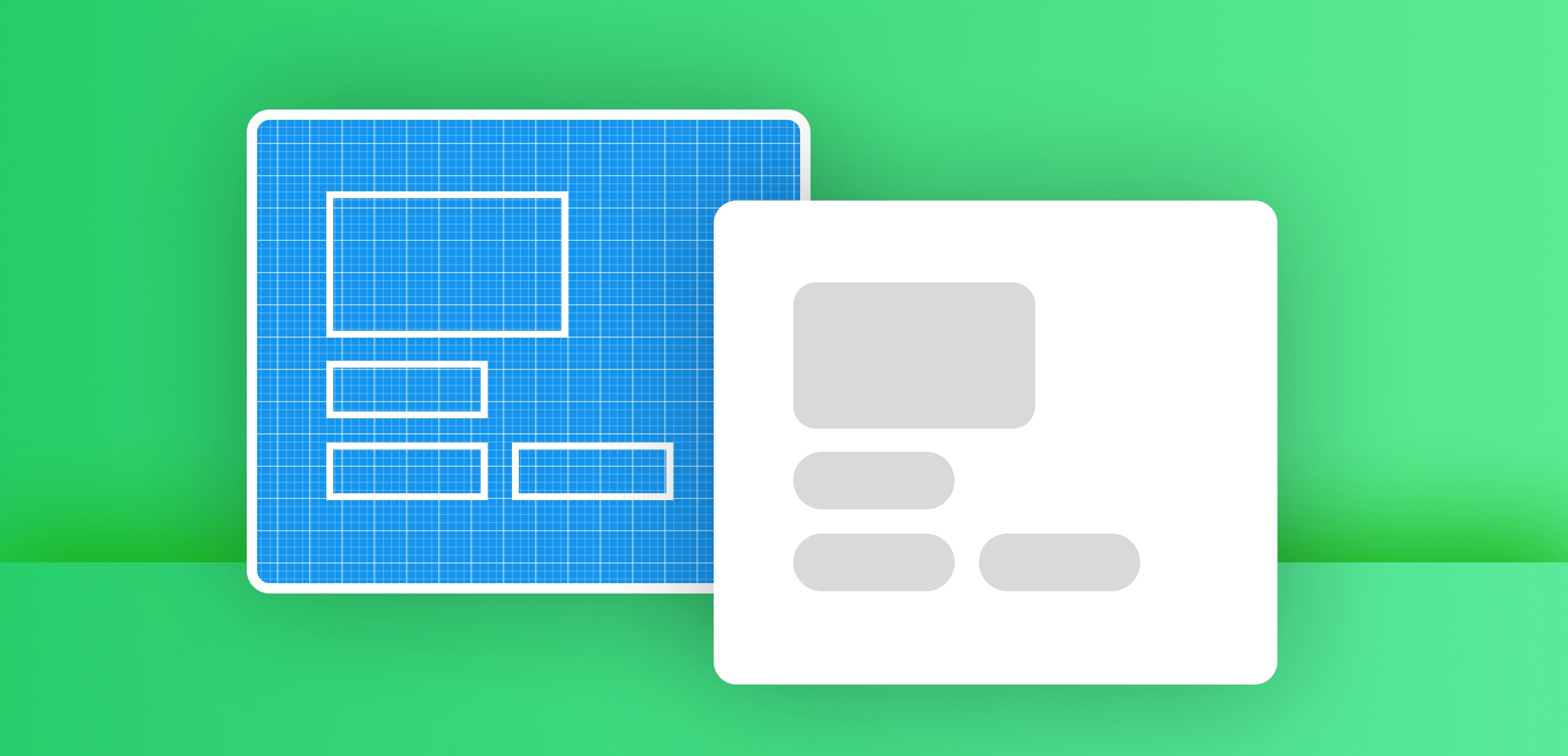
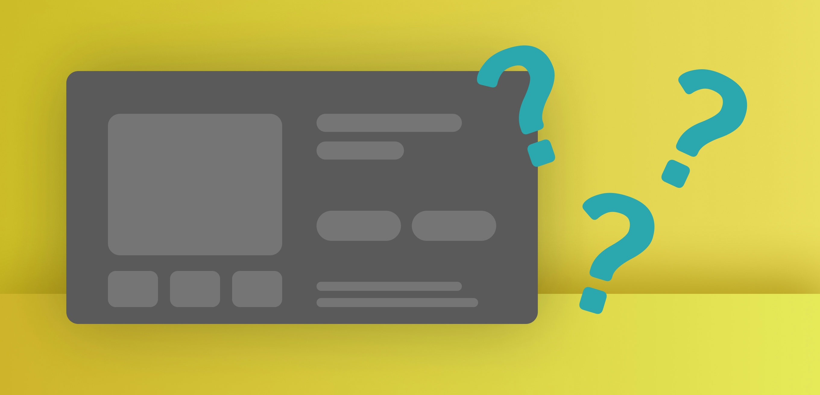
Let’s say you want to add a new custom feature to your Shopify store.
It could be a custom product form that adds new fields to the order’s line item. Or a customized search widget. Or a box that lets the user add cross sell products to their order. Or a promotional banner on your sliding cart drawer.
What you usually do is contact a person or agency, describe what you need, and start a project.
But before you do that, why not give the design a shot yourself?
This will prevent a lot of confusion, help the developer provide an accurate quote, and save you a lot of back and forth. It’s much easier than trying to communicate your requirements in words.
Here are some tips to help you create a rough design of the feature you want. They’re a summary of a design process, but this can be more than enough in a lot of cases.
Where to design
You can design pretty much anywhere.
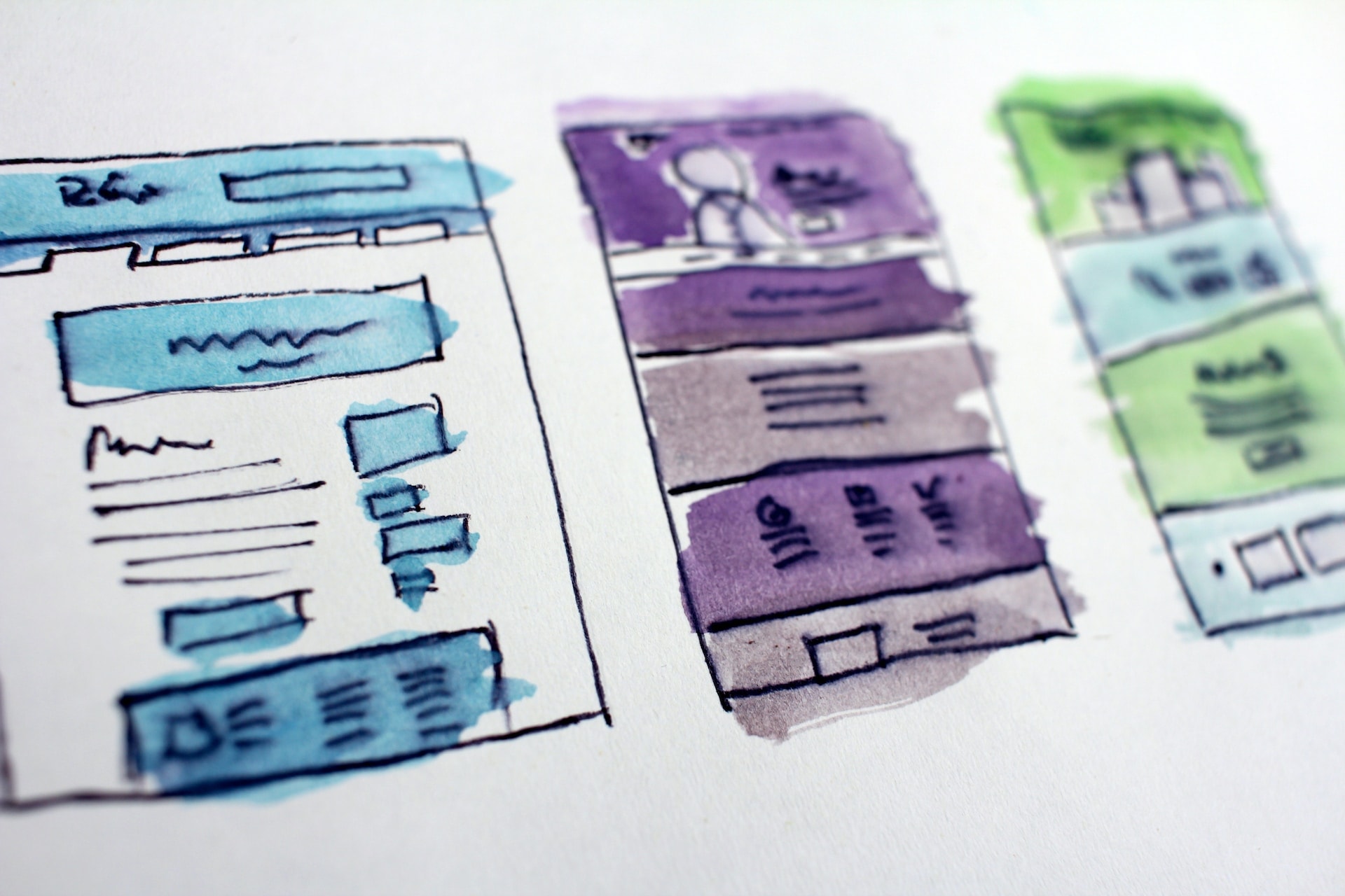
If you’re good with tools like Figma, create a draft there. Even better, use an HTML to Figma plugin, paste your page’s URL and design on top of your actual website’s design.
Or, you can use Canva. Or MS Paint. Or any other application, where you can add shapes and text.
Or just grab a pencil and a pager.
Your canvas
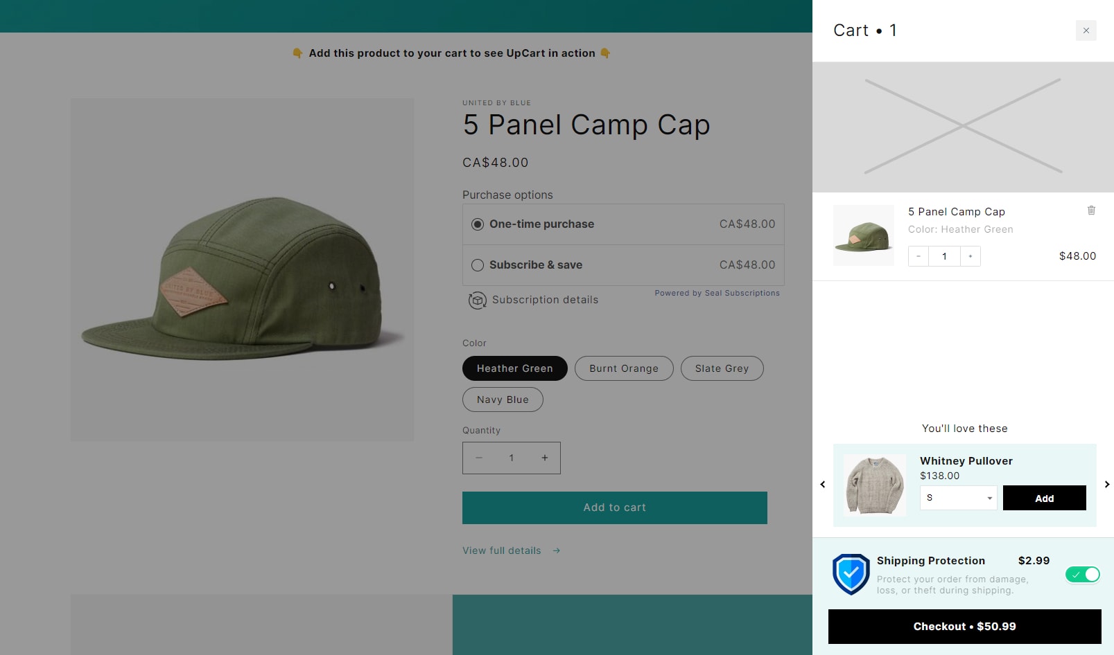
Ideally, you should start by drawing the existing page where the feature will go.
Context is important. Whoever implements the feature will want to see how you imagine it inside its surrounding elements.
The first content
Then, think of the basic “user story”. Think of what the user who visits your website will see and do on the new feature.
Start by drawing that in a very rough manner.
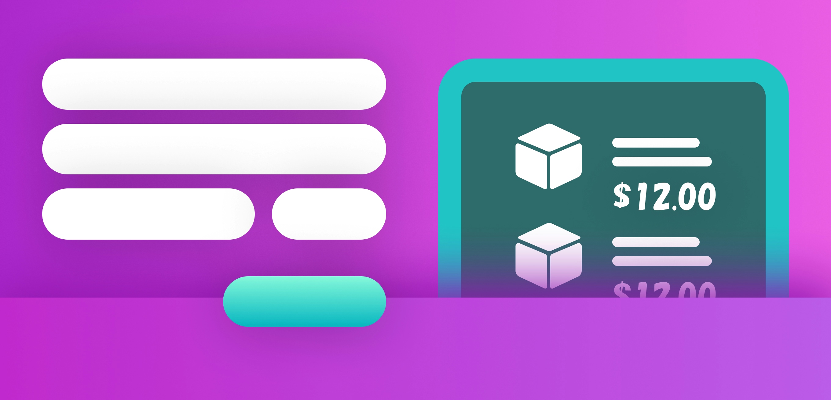
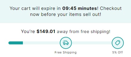
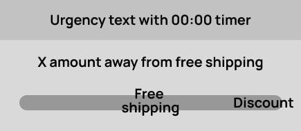
Imagine the content that you want to display. A title, a button, an image, a form input, a progress bar or loading indicator.
Add the elements in the general positions you think they should be.
You now have the basic content.
User journey
Consider how the user will interact with the element, step by step.
Maybe they first click a link here, then make a choice there, then they see some product cards.
Create copies of your initial design, and design each step’s content. From start to finish.
You can be as exhaustive as you want. You can imagine situations like showing an error message or a loading screen.
Of course, you may not need many steps. For example if you design a section for your homepage to show testimonials, it can be only one screen.
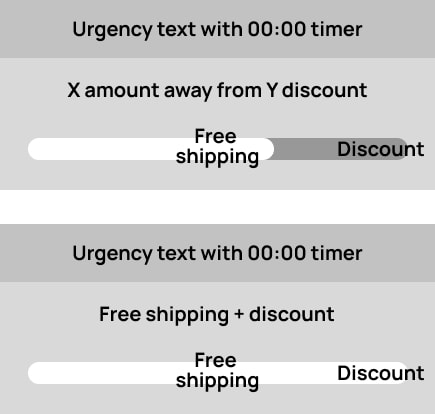
Another way you can split the user journey is into states.
Think of the different states your feature could be in.
For example: Zoomed in / out, open / closed, empty / filled, first step / second step / last step.
Element hierarchy
Want to take your design to the next level?
Place yourself in the shoes of your user. What’s the most important element on each step of their journey?
Maybe on the first step it’s a text field. On the next step it’s a button. On the last step another button.
On each step’s design, find a way to make the element prominent.
Don’t forget to look at the feature together with the surrounding elements. What may seem prominent inside a widget, may be lost if there are large prominent elements around it, on the page.
How do you make it prominent? Here are some ways:
Give it an accent color, or a color that has high contrast. If the page is white, make it black. Make sure to use any existing accent colors of your theme, to avoid an inconsistency.
Make it much larger.
Add space around it. Split a page in half, with the left half showing 5 elements, and the right showing the important element with space around it. That element will be easier to reach.
Again, try to keep the element’s style consistent with the rest of the theme.
Of course, if you don’t have any design skills, you don’t need to worry about the details. Try to clearly show which element is the most important.
Texts
Some tips for copy:
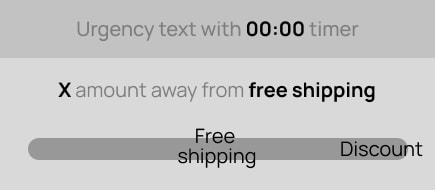
Make it easy for the user to understand the meaning. In a button to submit a search, you wouldn’t say “Go”. You’d say “Search” or “Find products”.
Add an explanation if needed. Don’t try to keep things minimal when the user might not be sure what they are seeing, or what they need to do. Write “No results found” on a box with search results, instead of keeping it blank.
Include recognizable icons. You don’t need to design the icon. You can Google something like “icon for settings” and paste into your design.
Copy other websites
If the feature you need can be found in other stores, look at what they are doing.
Make sure to notice what you don’t like about them. If they’re confusing in some way, think of what’s missing. It could be an explanation, or a layout that’s more familiar.
Also, on your design go for whatever is familiar to people. Avoid innovative layouts. Your ad spend isn’t the best way to research those.