6 website design gimmicks that hurt eCommerce performance
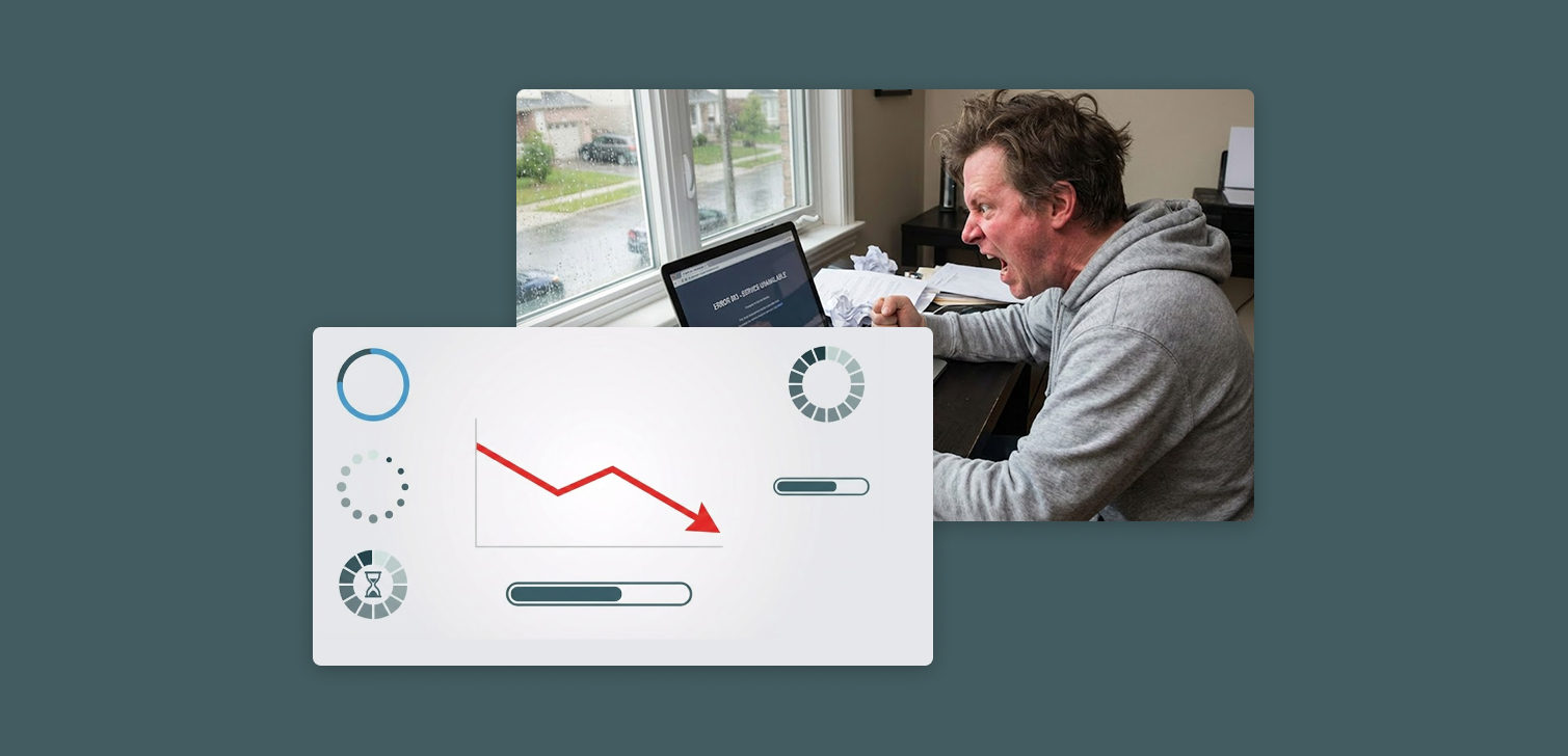
It’s easy to get excited about creative design features that make a site stand out. But what feels innovative to a designer often feels frustrating to a shopper.
For eCommerce stores, user experience is the product. Every interaction - scrolling, loading, navigating - affects whether someone buys or leaves. Even small visual flourishes can slow things down or make visitors feel lost.
Here are six design effects that often look impressive but can quietly destroy conversion rates.
1. Strange scroll patterns (scroll jacking)
Some sites override normal scrolling behavior. For example:
Pages that “snap” between sections like slides
Scroll speeds that are slower or faster than usual
Scrolls that trigger animations instead of moving the page
These effects break user expectations. People are used to natural, consistent scrolling. When it doesn’t work, they feel out of control.
For eCommerce sites, this friction is deadly. Visitors want to browse and compare products quickly. If scrolling feels unpredictable, they’ll close the tab.
Scroll jacking might have a place on portfolio or storytelling sites. But even there, it should be tested carefully. In roughly 80% of cases, it harms usability.
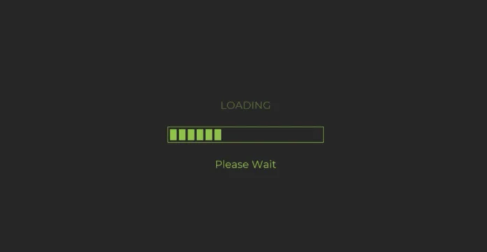
2. Screen loading indicators
A loading animation can make sense for heavy web applications that pull large amounts of data. But an eCommerce store isn’t one of them.
Visitors come to view and buy products. Showing them a loading spinner before the content even appears interrupts that flow. Every extra second adds to bounce risk.
There’s another problem: if your JavaScript breaks or an asset fails to load, the loading indicator might never go away. That’s a dead site.
If your site is slow, it’s better to optimize images, scripts, and server response times than to cover up the delay with an animation.
3. Heavy 3D animations
You’ll sometimes see these on creative agency sites, where the visuals themselves are the product. But they rarely belong on eCommerce stores.
3D graphics require significant GPU power and bandwidth. On mobile devices, that can mean lag, overheating, or even crashes.
There’s a narrow exception: a small, contained 3D element used for a specific purpose (like rotating a product model on a single page). Outside of that, it’s unnecessary weight.
4. Slow animations and transitions
Subtle animations can make a site feel smooth. But when they’re slow, they turn browsing into a chore.
A common offender is the slow fade-in. Imagine comparing products across several sites and waiting half a second for every new page to load its content. It adds up.
Even a 300–500ms delay can feel unresponsive. On desktop, it’s annoying. On mobile, it’s worse.
Keep animations short and purposeful. If they don’t make navigation clearer or faster, cut them.
5. Screen overlay effects
Snow falling over the page. Particles floating around. Seasonal overlays that dim the entire screen.
They might look festive, but they also increase CPU usage and reduce frame rates. When built inefficiently, they can drain mobile batteries and make scrolling stutter.
Overlays can also interfere with text readability or clickable elements, frustrating users who just want to get to checkout.
Unless performance is tightly controlled and the effect is temporary, it’s best to skip them.

6. Background music
It sounds like a joke, but it still happens. Some sites autoplay music when you visit (after the first interaction).
People shop in many different contexts - at work, on public transport, in quiet environments. Audio that starts unexpectedly is intrusive and often leads to an instant exit.
If you want to use sound, make it user-initiated and optional. Let people control the experience.
When these effects can work
There are exceptions. Large brands with full design and development teams can sometimes implement complex visual effects correctly. When done well, these can:
Reinforce brand identity
Create a memorable first impression
Build trust in design quality
But that level of execution requires deep testing, optimization, and accessibility consideration. For most eCommerce businesses, it’s not worth the trade-off.
FAQ
1. Are animations always bad for eCommerce? No. Small, fast transitions can help guide attention or signal state changes. Problems start when animations delay access to content or affect performance.
2. What’s the best way to test if an effect hurts conversions? Run an A/B test. Compare performance metrics like bounce rate, session time, and checkout completion with and without the effect.
3. Can scroll animations ever help storytelling? Yes, on branded campaigns or landing pages focused on storytelling. Just make sure the animation doesn’t interfere with scrolling or basic navigation.
4. How can I make my store feel dynamic without gimmicks? Use micro-interactions, fast hover effects, or responsive motion tied to user input. Keep it subtle.
5. Is there a checklist for judging visual features? Ask: Does it load fast? Is it mobile-friendly? Does it help users accomplish something? If the answer isn’t yes to all three, reconsider.
Final thoughts
Good eCommerce design isn’t about showing off what’s possible in code or animation. It’s about clarity, speed, and trust.
The simplest experience usually performs best. Focus on how visitors interact, not on how the site looks in a design presentation. If a “cool” feature doesn’t make the journey smoother, leave it out.


