Smarter filtering for large product lists
Filter menus often grow out of control as a catalog expands. When a store carries dozens of brands or product attributes, the filter panel can turn into a long, tiring scroll. Shoppers know the option they want, but the interface forces them to work for it. A small interface change can ease that load.
Why long filter lists become a problem
Large product catalogs usually bring long lists of filter values. A page might have 40 manufacturers or more than 20 color variations. On desktop, it clutters the sidebar. On mobile, it becomes even more difficult because the filter drawer is already a tight space.
A few friction points show up again and again:
Endless scrolling to find a single value.
High visual effort when the list blends together.
People missing the option they want because their attention drops halfway through.
Filters are supposed to help shoppers narrow choices. When the filter UI becomes work, shoppers sometimes back out instead of refining their view.
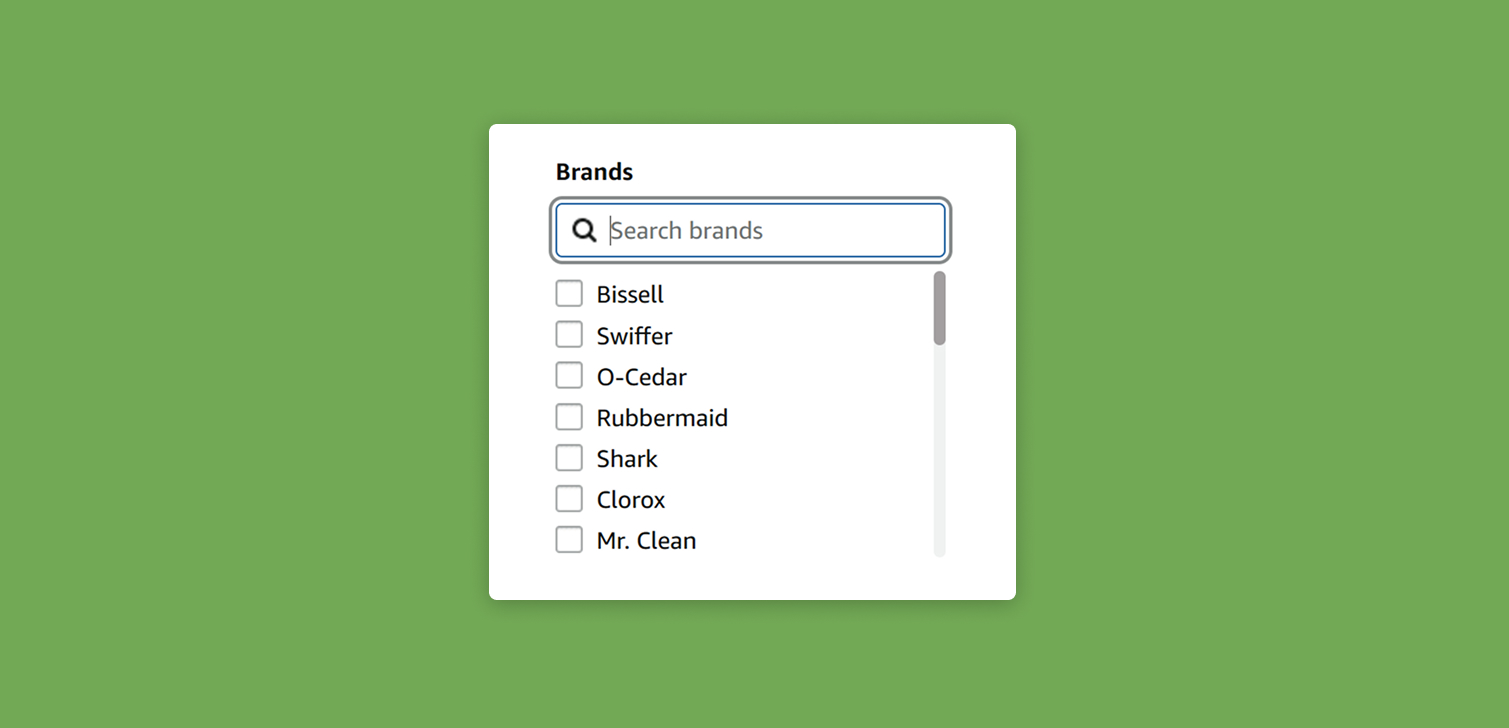
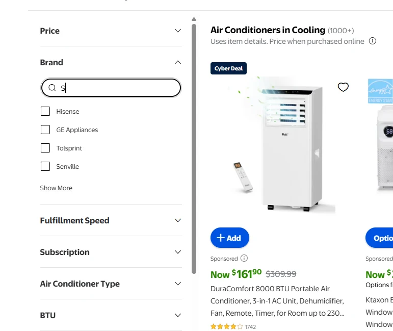
The simple fix: add a search box inside the filter
A search field inside a filter group lets people type "Sam..." instead of scanning for Samsung across a long list. It feels natural because search is already familiar in other contexts. It also behaves fast because the filtering happens on the client side. No backend call is needed.
This approach works well when a filter has more than 15 or 20 options. The number varies based on layout, device, and viewport height, but the principle holds. Once a user has to scroll to explore every value, it's time to rethink the UX.
A few use cases where an internal filter search helps:
A fashion store with dozens of brands.
A hardware catalog where materials, dimensions, and model names create large sets.
Any store where you add new attributes over time.
People interact with these lists often, so even a modest improvement can create a meaningful lift in ease of use.
Practical considerations for implementation
From a development perspective, this feature is usually straightforward. For Shopify stores, it's not the kind of customization you want to use an app for. JavaScript can read the list of available values, then filter them as the user types. There’s no need to redraw the entire page. Only the list updates.
A few practical notes when designing the feature:
Make sure the search box is visually tied to the filter header so users see it right away.
Keep placeholder text simple, like "Search manufacturers".
Test on mobile early because cramped layouts need extra care.
Don’t hide the first few options entirely. Let users understand they can still scroll if needed.
Once live, monitor behavior. You might see faster filter selections or fewer abandoned filter panels.
FAQ
Why not rely on the sitewide search instead? Sitewide search brings up searchable products, not filter values. Shoppers who know the brand they want still need a quick way to narrow the collection view.
Will users notice the search box? Most do, especially when the filter group is long. Place it near the top so it’s visible without scrolling.
Does this slow the page down? Not usually. The filtering happens in the browser, so it’s almost instant.
Should the site auto-select the result if there’s only one match? Some teams choose that, but most let the user click. It avoids surprises and keeps the interaction predictable.
Conclusion
Long filter lists make catalog browsing harder than it needs to be. Adding a simple search box inside large filter groups helps people find what they want faster, especially on mobile. It’s a small upgrade, easy to build, and often improves the overall flow of product discovery.


