Why inconsistent product photos quietly kill conversions on e-commerce sites

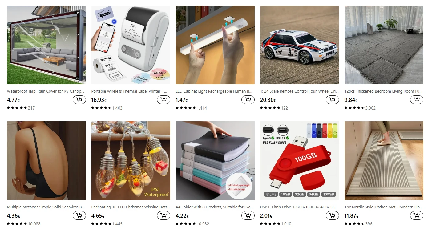
If your online store shows products with different photo styles - some zoomed in, some far away, some on white backgrounds, others on color - you might be making it harder for visitors to buy.
When product photos feel like they were taken by different people, the browsing experience becomes visually noisy.
It’s about clarity and trust.
Let’s break down why visual consistency matters and what you can do to make your product listings feel more cohesive and professional.
What “inconsistent” really means
Many store owners think inconsistent photos just look a bit messy. In reality, they change how people perceive your entire site.
Here are some of the most common inconsistencies that make a page harder to scan:
White backgrounds mixed with colored or textured ones
Different photo angles or zoom levels
Cropping that changes from product to product
A mix of vertical and horizontal orientations
Lighting that varies too much, creating uneven tones
When you put these side by side, it stops feeling like a single brand experience.
It really feels like a marketplace where random sellers uploaded their own photos.
Why inconsistency hurts user experience
It comes down to how our brains process visual information. When visitors scan a category or search results page, they’re not looking at every product individually at first. They’re trying to make sense of the overall layout and patterns.
Here’s what happens when photos don’t follow a consistent structure:
1. Increased cognitive load
The human brain likes patterns. When it recognizes one, it can process information faster.
If one photo is close-up and another is zoomed out, the brain has to work harder to understand what it’s looking at. That small bit of extra effort builds up across dozens of products.
You’ll often see this play out when someone scrolls a product grid. Instead of effortlessly scanning, they pause and refocus. That’s friction - and friction hurts conversions.
2. Slower product comparisons
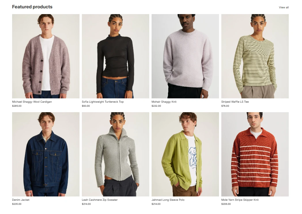
When product photos share the same angle, background, and framing, shoppers can quickly spot differences between items.
But if each image is composed differently, they have to look longer at each one to make a fair comparison. That slows them down and can even cause decision fatigue.
For example, if you sell shoes, showing one pair from the side and another from above makes comparison harder. Consistent side shots make the differences immediately visible.
3. It makes your site look untrustworthy
Visual inconsistency can make even a well-designed website look unprofessional. When every product photo feels like it came from a different source, it sends a signal: this business might not be serious.
That doesn’t mean customers think about it consciously. It’s more of a feeling. A site with mismatched visuals can come across as small, unreliable, or unsafe to purchase from.
How to fix inconsistent product images
The good news is that consistency is easy to build once you define a clear standard.
Here’s a simple approach that works for most e-commerce brands:
Set one background color and lighting setup - usually a white or light gray background.
Pick one main angle per product type - for example, front view for shirts, side view for shoes.
Decide on crop and framing - every image should show the same amount of padding around the product.
Document everything - create a short photo guideline that anyone on your team (or freelancer) can follow.
Audit old photos - replace or retouch inconsistent ones over time.
If your catalog is large, start small during your next optimization round, with your best-selling products first. That’s where visual consistency will have the biggest impact.
FAQ
1. What if I sell products from multiple suppliers with different photo styles? You can still standardize. Re-edit or re-crop supplier photos to match your own format. Even partial consistency helps.
2. Do lifestyle photos need to match too? Not exactly, but they should share a general mood and color tone. Save variety for social media or ads, not product listings. It's about brand consistency.
3. Is it worth hiring a professional photographer? If your product range is stable and photography is part of your brand identity, yes. Otherwise, consistent DIY photos with a good light setup can also work well. AI tools can help too.
4. What’s the biggest visual mistake small stores make? Mixing image ratios - for example, some square, some rectangular. It breaks alignment on collection pages and makes the grid look uneven. It also creates layout shifts when you change images in sliders.
5. Should I include multiple angles on the main collection page? No. Keep variety for the product detail page. The collection view is for easy scanning, not detailed evaluation. What you can do, is show more images with a slider or hovering, on the product card.
Bringing it together
Consistency in product photos (and swatches within products) isn’t about design perfection. It’s about reducing friction for shoppers. When every photo aligns in style, it helps visitors process information faster, compare products easily, and trust your store more.
Small visual improvements can have a measurable effect on conversions.
So start with defining your photo standards, and build from there.


