Why your website might look perfect to you (but not to your visitors)

If you manage or build websites, there’s a simple but common blind spot: what you see on your screen isn’t what your visitors see.
Designers, developers, and editors often work on large monitors or inside tools that show a limited version of the site.
Visitors, meanwhile, view it on phones, tablets, or smaller laptops.
That gap creates real problems — layouts break, buttons move, text overflows, and conversions drop.
This article walks through why it happens, how to check for it, and practical ways to design with your users’ screens in mind.
The invisible problem: working in the wrong screen size
Most people don’t realize how often this happens. Each person involved in a website project uses their own setup:
A designer creates mockups on a 27-inch monitor at full resolution.
A developer tests in a half-sized browser window.
A content editor updates the page inside a CMS preview that doesn’t reflect the real layout.
When each role views the site differently, the end result can feel disjointed. You might think everything looks clean and balanced, only to find that on an iPhone, the text overlaps the image or a key button disappears below the fold.
How to check what most users actually see
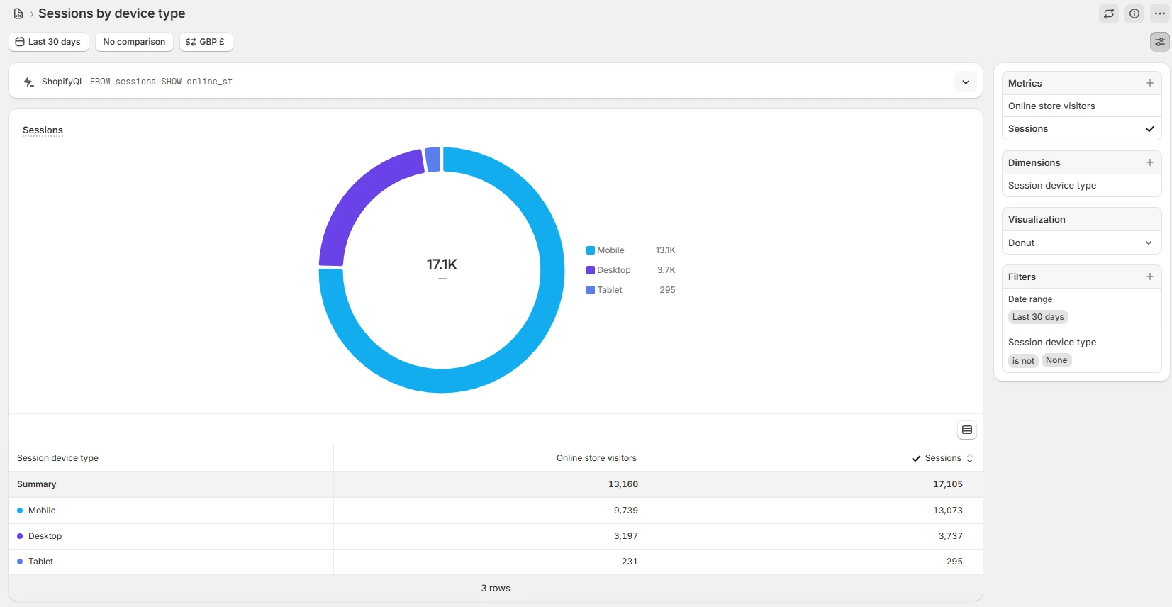
The easiest way to catch this problem is to look at your analytics. Most analytics tools (like Google Analytics or Plausible) show you which devices and screen sizes your visitors use.
Open your analytics tool.
Filter by device or resolution.
Note the top few resolutions and devices.
You’ll usually notice patterns. Maybe 60% of your traffic is on mobile, or maybe your desktop users lean toward laptops, not wide monitors.
Once you know, match your testing setup to that data:
Use your browser’s responsive mode to view common screen sizes.
Physically check your site on a few real devices when possible.
Always preview edits in the same format your users are most likely to see.
If you work in a team, set a shared reference: “We test and preview in 390px mobile width and 1440px desktop width.” That small alignment avoids countless issues later.
What if traffic is split between mobile and desktop?
Sometimes analytics show a 50/50 split. In that case, start with mobile.
Mobile users usually face more constraints - smaller screens, slower connections, more distractions. If your site works well for them, it’ll almost always work for desktop users too.
Here’s a simple workflow:
Design or preview on mobile first.
Check key actions: Can users read, scroll, and tap easily?
Then test on desktop to confirm the layout still feels balanced and polished.
You’ll often discover that simplifying for mobile improves your overall site. Shorter headlines, fewer popups, and better spacing tend to help everyone.
Real-world examples of screen size mismatch
Here are some typical cases where this issue shows up:
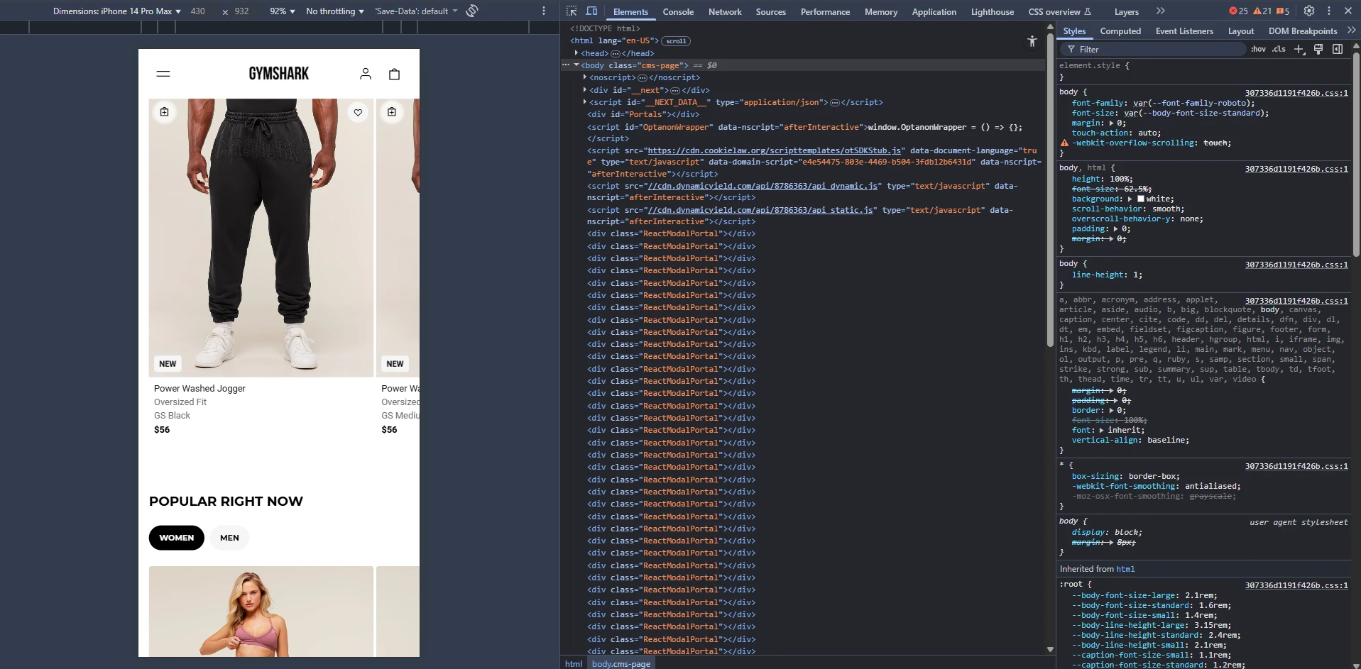
A banner image that looks fine on desktop, but hides the headline on mobile.
A table that fits neatly in a CMS editor, but breaks into unreadable chunks on phones.
A checkout button that falls below the visible area on smaller screens.
Text sizes set in pixels instead of relative units, making them tiny on certain devices.
Catching these issues early saves rework later. Testing on the right screen size should be part of every content or design review, not just at launch.
FAQ
1. How often should I check my site’s display on different screens? At least once a month, or any time you make a layout or content change.
2. Do responsive templates solve this automatically? Not completely. They handle scaling, but design details (like text wrapping or image ratios) can still break.
3. Should I design separately for mobile and desktop? Only if your audience and goals are very different. In most cases, one responsive design works fine, as long as you test across sizes.
A simple habit that makes a big difference
The bottom like:
Make it a habbit.
Browse your website on a mobile device as much as possible.
You'll find that you catch many more issues and find many more areas of improvement. Which can lead to a website with a much higher conversion rate.


