How clear pricing on product pages reduces friction and lifts conversions

Many stores put a lot of effort into photos and descriptions, then treat pricing as a single number on the product page.
That works until customers hit checkout, see a different total, and feel misled. Even if you did everything "by the book," that moment of surprise is enough to make people bail.
Price information on a product page can almost never be too clear. The risk is not that you over-explain. The risk is that customers need to think too much or feel uncertain.
Below are three areas where most eCommerce stores leave money on the table: taxes, discounts, and unit prices.
Why price clarity matters more than a perfectly "clean" layout
Before the details, it helps to frame the tradeoff.
People sometimes ask: "Doesn't all this extra information distract from the main action, which is clicking Add to cart?"
It can, if you dump information without structure. But in practice:
More visitors leave when they find prices confusing.
Fewer visitors leave because the price block had an extra line of text.
Trust issues, even small ones, are very hard to fix later in the funnel.
A clear price element should:
Make the final price predictable before checkout.
Show how the price was calculated, at least at a high level.
Highlight the most important part first, and let the rest support it.
The design work is to present this information without turning the area into a wall of text.
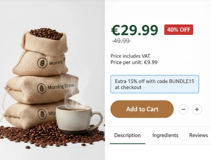
Taxes: no surprises between product page and checkout
Tax handling differs by country, region, and sometimes even product type. That is your problem, not the customer's.
Some examples:
In many EU countries, VAT must be included in the displayed price.
In other countries, sales tax is added at checkout.
Some regulations prefer or require you to show both.
Whatever the rules are for you, the key is simple: customers should be 100% sure that the price they see on the product page will match what they see at checkout, aside from shipping.
Practical ways to do this:
If prices include tax, add a small label like "Price includes VAT."
If tax is calculated later, say "Taxes calculated at checkout."
If your market expects both, show the base price and a "Price with VAT" line.
For advanced stores, a VAT on / off toggle for business vs consumer buyers can help.
One exception: if you only sell in a single country, and every competitor uses the exact same convention, a separate tax note might not add much. In that specific case it can be noise.
Everywhere else, clarity wins.
Discounts: show the story, not just the final number
A lot of stores only show the final discounted price. That hides useful context and weakens the perceived value of the offer.
Make sure the price block includes:
Original price.
Discounted price.
Discount amount, either as a percentage or a value (e.g. "20% off" or "$10 off").
When to use which:
Higher priced items often perform better with a percentage discount. "40% off" feels stronger than "$80 off" when prices are high.
If your audience already knows your price ranges, repeat buyers for example, percentage discounts tend to be easier to process.
If you have active discount codes, do not hide them in a bar at the top of the site only. Add them near the price:
"Extra 20% off with code CODE_ABC at checkout."
"Buy 2, get 15% off with code BUNDLE15."
This helps in a few situations:
Shoppers comparing your offer with competitors.
People on the fence who just need a small nudge.
Repeat visitors who came back because of a promotion.
Unit prices: help customers compare and commit
Unit prices are one of the most underrated pricing details on product pages.
They matter especially when:
You sell bundles or multipacks of a base product.
There is a volume discount that changes the effective price per item.
You use measured pricing, like per kg, per liter, per meter, or per foot.
Good practices:
For bundles, show "Price per unit: $X" near the total price.
If there is a discount on the main product, show the discounted unit price too.
For measured pricing, always show the price per measurement unit, not just the total.
This helps customers compare:
Your bundle vs a single unit.
Your offer vs a competitor's product that uses a different pack size.
Your discount levels across different variants.
Some brands avoid unit prices when they are higher than competitors, hoping customers will not notice. This often backfires. The harder it is to understand your pricing, the more people will abandon the page.
Transparent unit prices can actually justify higher prices if your product quality or brand is stronger. At least people know what they are paying for.
Designing the price element so it does not overpower the page
More information does not have to mean more clutter.
A practical structure for the price block:
One primary element that stands out in the local hierarchy.
For a strong promotion, that might be the "50% off" label plus the discounted price.
For normal pricing, it is usually the main current price.
Supporting details in a smaller visual tier:
Original price with a simple strike-through.
Discount value or percentage.
Tax note.
Unit price.
Keep the entire price element slightly less visually prominent than the primary action.
The "Add to cart" button should still be the main focus.
The price explains, the button drives the action.
This way, the customer can scan top to bottom, understand the price, and move forward without hesitation.
FAQ
Do I really need tax labels if everyone in my country "knows" how it works? If you only sell locally and your market has one clear standard, you might skip it. If you sell across borders or see confusion at checkout, add the label.
Where should I put unit price information on the product page? Place it close to the main price, not buried in the description. Smaller font is fine, but keep it visually tied to the pricing block.
What if my promotions change often, will all this clutter the interface? Design the price block so labels can be toggled on and off. The structure stays, only the content changes. This keeps the layout stable.
How do I know if price clarity is actually improving conversions? Run an A/B test where one variant adds tax notes, clearer discounts, and unit prices. Track add to cart rate and checkout completion.
Wrapping up
A product page is not only about selling the product. It is also about removing friction. Clear, transparent pricing around taxes, discounts, and unit costs makes it easier for people to trust what they see, understand what they will pay, and follow through to checkout without second guessing.


