Small link changes that turn dead ends into sales
Most e-commerce work goes into big things. Homepages, product pages, ads, email flows. That makes sense, they handle most of your traffic.
But there are also quiet corners of your site where visitors end up and then do nothing. No next step, no product, just a dead end. A small link in the right place can change that.
This is about adding links in places people occasionally click on, but that rarely get optimized. It’s a 5 minute job in many themes, and it can bring in extra orders each month, week, or even each day, depending on traffic.
Why these small links matter
It’s easy to ignore low-traffic elements. Announcement bars, empty carts, 404 pages, the footer. They’re not the stars of your analytics dashboard.
Still, three things make these spots worth attention:
People who reach them haven’t fully given up yet.
They often have no clear "what now" path.
A single, relevant link can move them closer to buying.
Think of these areas as safety nets. When someone’s journey breaks - a product is unpublished, a tab gets closed, an add to cart fails - you can catch a portion of those sessions and send them to a useful place.
Over a month, that might be a handful of extra orders. Over a year, it’s real revenue that came from a very small change.
Smart places to add strategic links
Here are four practical placements you can test on almost any ecommerce site.
1. The announcement bar
If you already use an announcement bar at the top of the site, it’s probably doing one of two things:
Promoting free shipping or returns
Highlighting a general benefit of your products
In many stores, this bar is just text. That’s fine, but it can also be a link.
A simple pattern that works well:
Message: "Free shipping on orders over $50."
Link: A collection of your bestsellers or "most popular right now."
That way, anyone who clicks the bar lands on a focused product list, not just the homepage again. You reduce friction and give them a clear next step.

2. The empty cart page or drawer
An empty cart is usually the end of a session. Someone removed items, or they clicked the cart icon out of habit and found nothing there.
Instead of showing a blank state with a "Your cart is empty" message, add:
A link to a collection of recommended products
Or a link to "Recently viewed" items, if your platform supports it
Example copy:
"Nothing here yet. See our most popular picks."
"Your cart is empty. Continue browsing our latest arrivals."
It’s a small nudge, but it prevents the cart from being a dead end. You guide people back to a place where a purchase is possible.

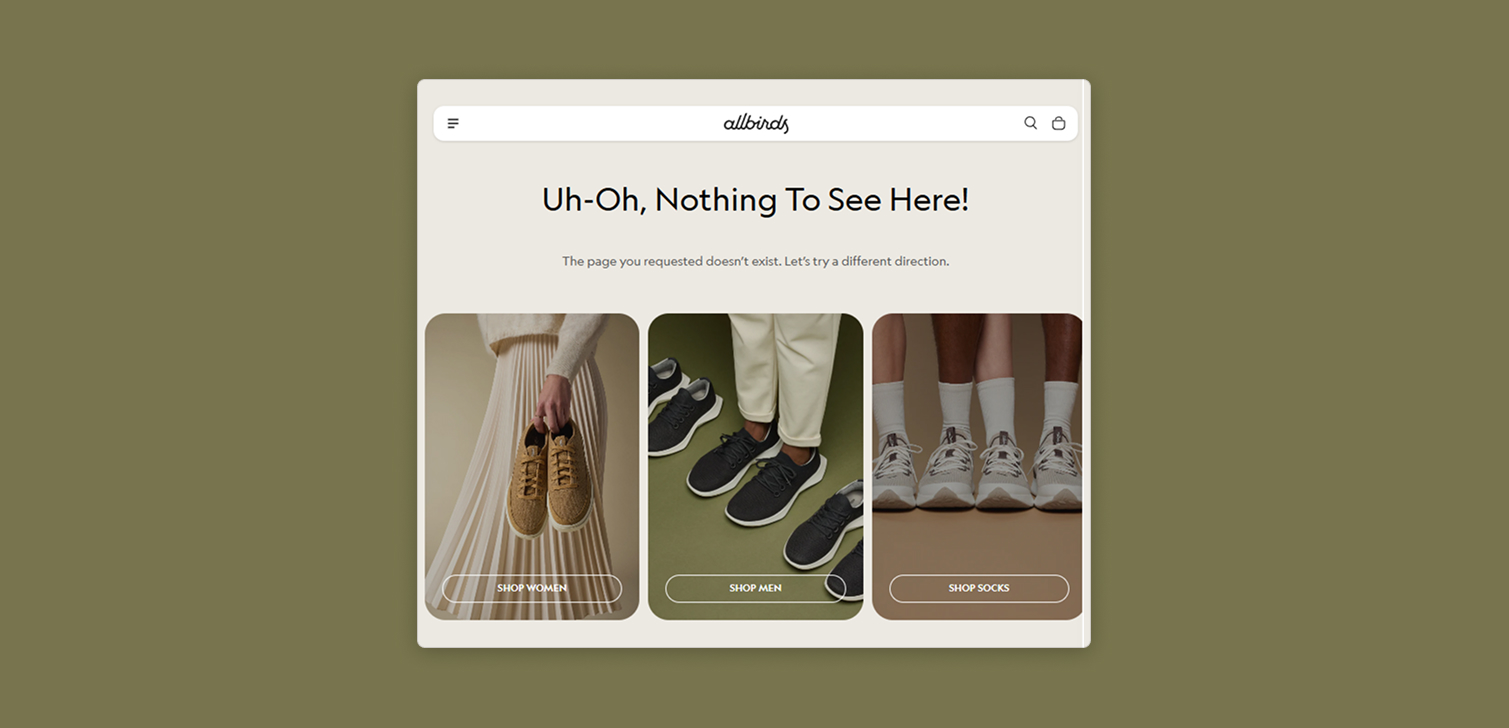
3. The 404 page
Visitors can hit a 404 page for many reasons:
Old links from social posts or emails
Unpublished or renamed products
Typos in the URL
If your 404 page just says "Page not found," you’re wasting a visit from someone who was already interested enough to click.
More helpful options include:
A link to a collection with all products and filters open
A link to key categories, such as "Shop men" or "Shop women"
A short search bar plus one "Popular products" link
The goal is simple. A person came looking for one thing, you show them where they can browse many things instead of leaving.

4. An extra link in the footer menu
Footer menus often act like a dumping ground. Policies, contact, FAQ, login. They’re useful, but they don’t always move people toward buying.
You can add a more commercially focused link, such as:
"Our best products of all time"
"Most loved by customers"
"Editor’s picks"
This plays on a strong motive: people like shortcuts to the best stuff. If someone scrolls to the footer, they may be wandering or distracted. The right link can pull them back into a curated shopping path.
What should these links point to
The placement is one part of the win. Where the link goes is the other.
Good targets for these strategic links:
A bestseller collection
A curated "top picks" or "most loved" collection
A "new arrivals" collection if your audience is repeat-heavy
A filtered view of your full catalog, if you have many SKUs
Try to avoid dropping people on a random product or a generic homepage again. The more focused the destination, the easier it is for them to start browsing.
If you don’t have curated and optimized collections yet, it’s worth creating one or two. They’re reusable across your site, ads, and email.
Measuring the impact
These tweaks are small, but you can still measure them.
Simple ways to track:
Add UTM parameters to the links and watch sessions and revenue in your analytics.
Use your platform’s reports to see how many orders started from these URLs.
Compare the performance of "before" and "after" if you have enough traffic.
You don’t need perfect attribution or an A/B test to know if it’s working. If you see a steady flow of sessions from these links, and some of them convert, you’ve turned a dead end into a working path.
FAQ
Do these links really matter if traffic is low? Yes. On smaller stores, every saved session helps. You may not see daily impact, but over months you’ll still capture sales that would have been lost.
Should I send people to discounts or to bestsellers? If you run a heavily promotion-driven brand, discounts can work. For most stores, a strong bestseller or "most popular" collection is a safer, cleaner default.
How many links should I add to each area? Usually one. Maybe two. Too many links create choice overload and people ignore them. Keep the decision simple.
Summary
Tiny site changes rarely feel urgent, so they get pushed aside. But links in announcement bars, empty carts, 404 pages, and footers can quietly bring visitors back to your products instead of leaving them stuck.
They won’t replace your core funnels. They will support them, catch a few lost sessions, and over time, turn more dead ends into actual sales.


